
UX and visual design on a small design team working as part of the OneDrive SharePoint organization in Microsoft.
Brief
The OneDrive brand experience ecosystem includes a spectrum of user touch-points including in-app, web, email and social.
Brand development and application work included production of a flexible and reusable email template, image bank curation, custom Microsoft style illustrations, microsite web design and marketing.
Invent and align
The primary goal of my work at OneDrive was to interpret the very minimal brand guide, and ensure that targeted marketing, in-app experiences and websites remained cohesive in terms of product look and feel and the wider Microsoft brand eco-system.
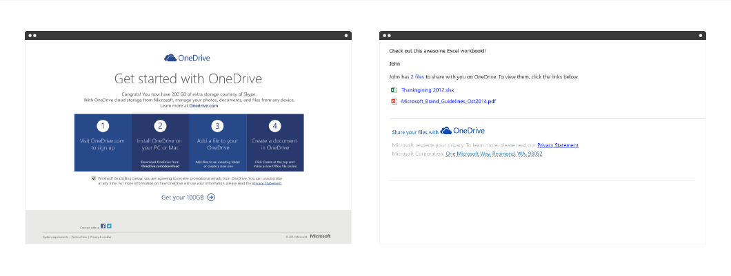
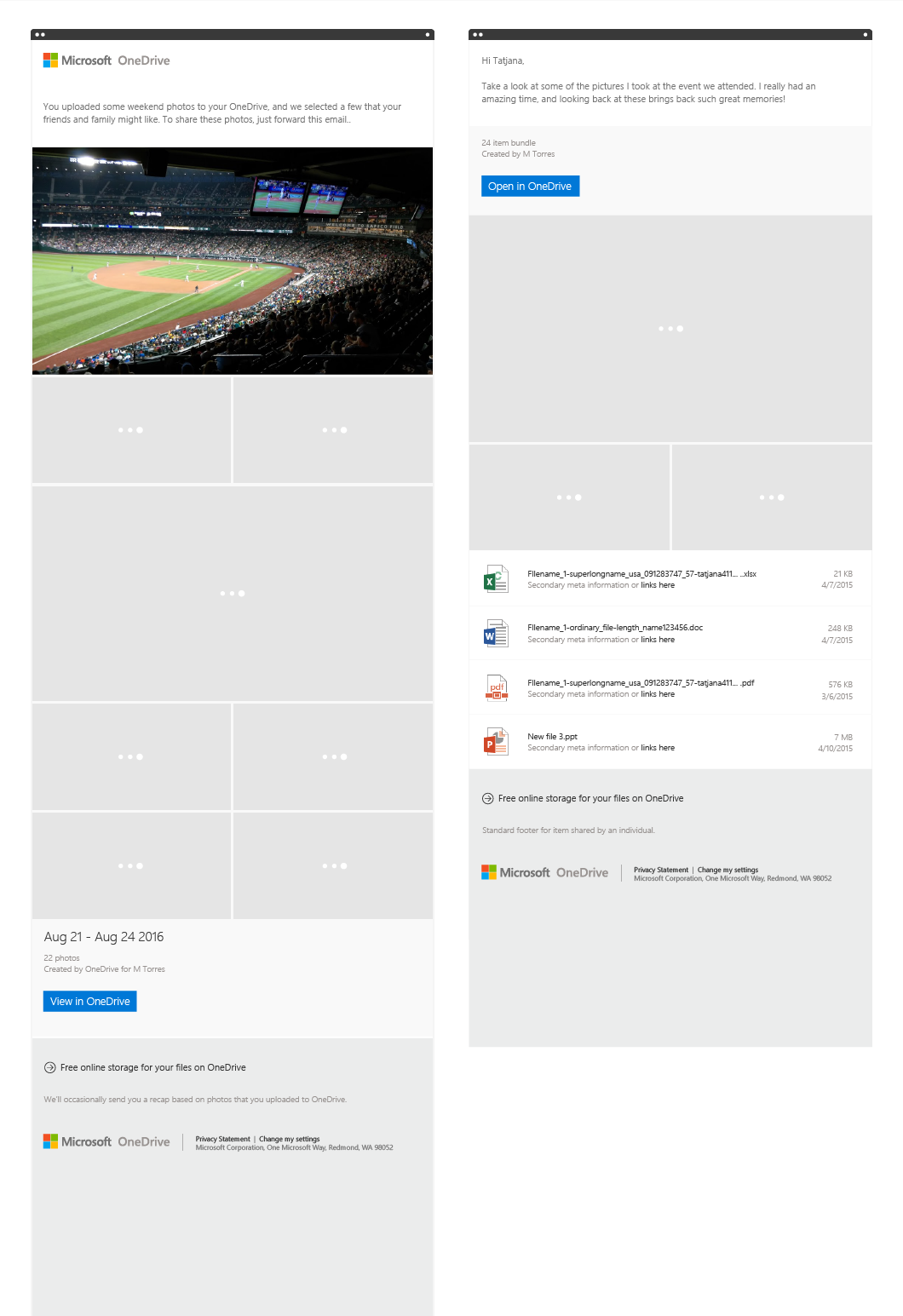
Email before state
Promotional emails weren’t exactly engaging for consumers, and transactional emails, whilst minimal and functional, lacked consistency and identity. All emails were fixed-width.
Process
Gather business requirements
Define user needs
Design template to include marketing & product notifications
Prioritize needs and requirements
Implement changes
Evaluate changes…
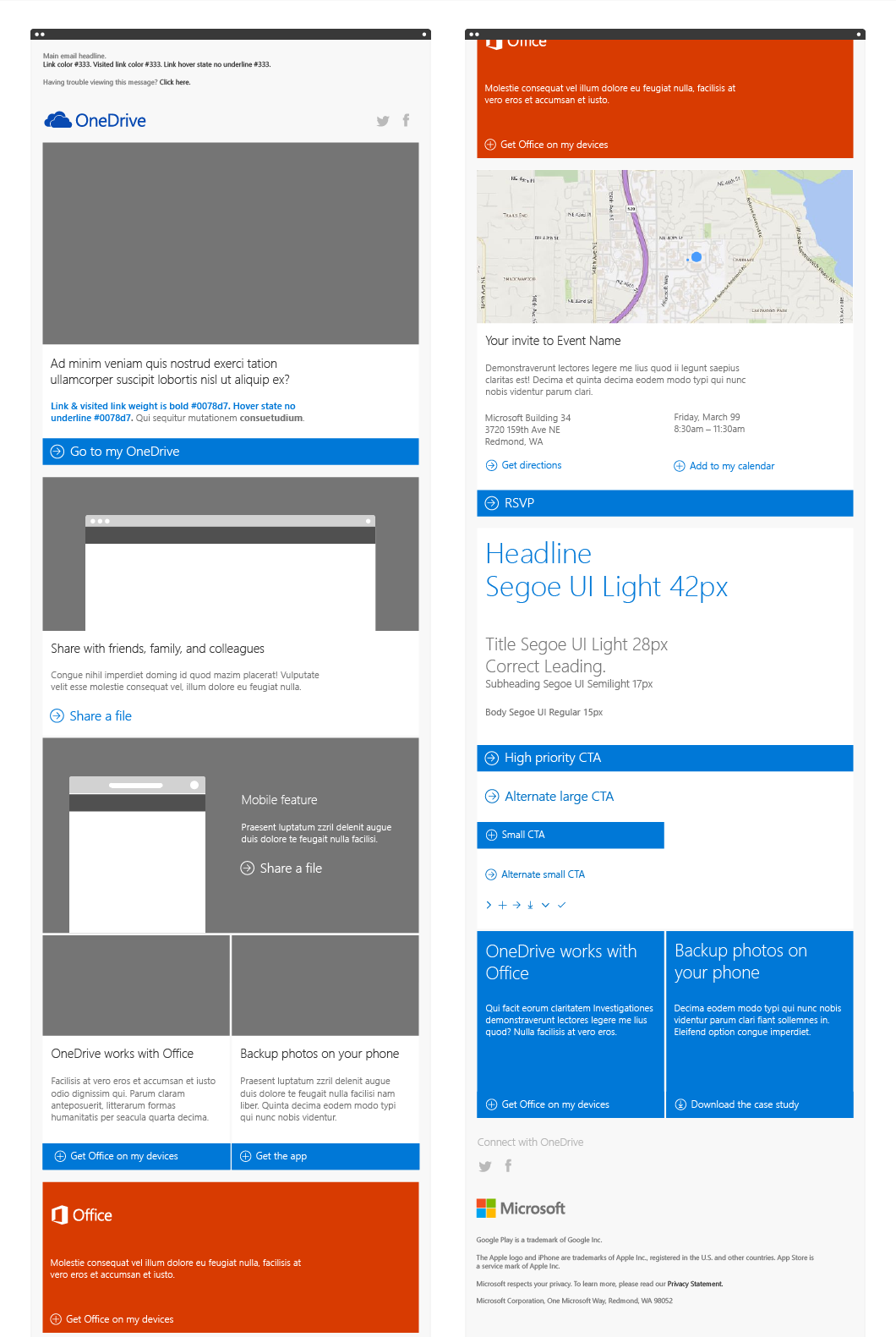
Version 1
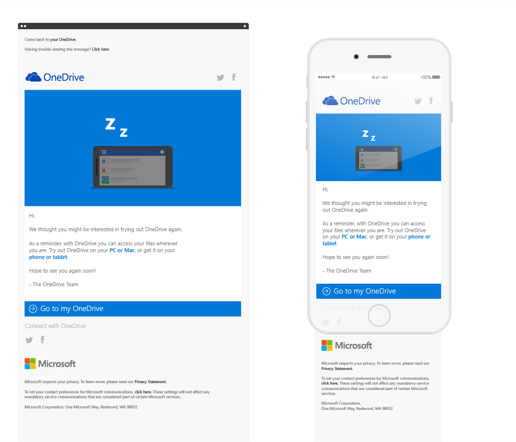
This process lead to the development of an email template with reusable content blocks, suitable for a range of user communication – from events, to product launches and co-branded promotions.
One template, hundreds of possibilities.
User mindset
OneDrive’s target user is “anyone with the ambition to turn ideas into actions, change their lives (or the world), or simply accomplish more, wherever they are”.
This idea really pushed the work to be mobile first, useable and deliver a consistent experience.
Version 2
After being used for around six months I was able to evaluate what aspects of the template were most successful and identify ways in which the design could be improved.
Invent and Simplify
With input from the wider product team I designed a second version of the template, integrating product triggered emails and notifications with a simplified marketing toolkit.
Illustration
Many of the marketing projects required custom illustration in the Microsoft style. These were used on sign-in/sign-out pages, email, websites and blogs and were often animated.
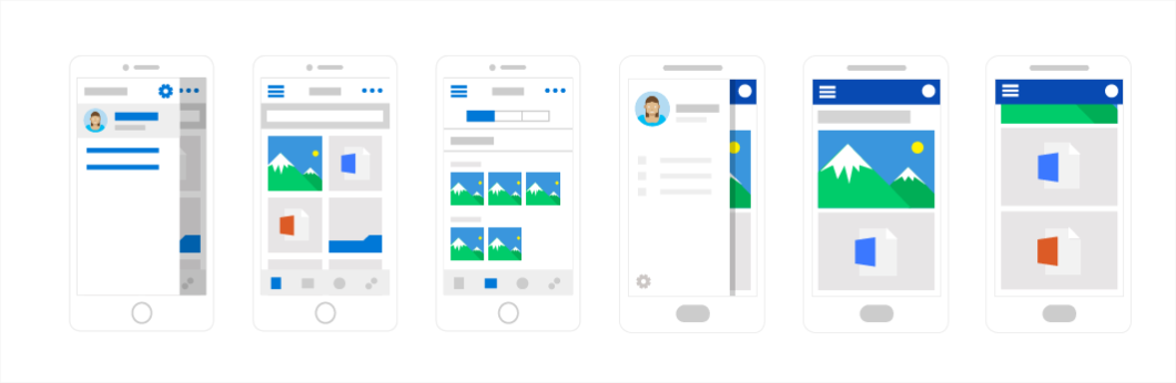
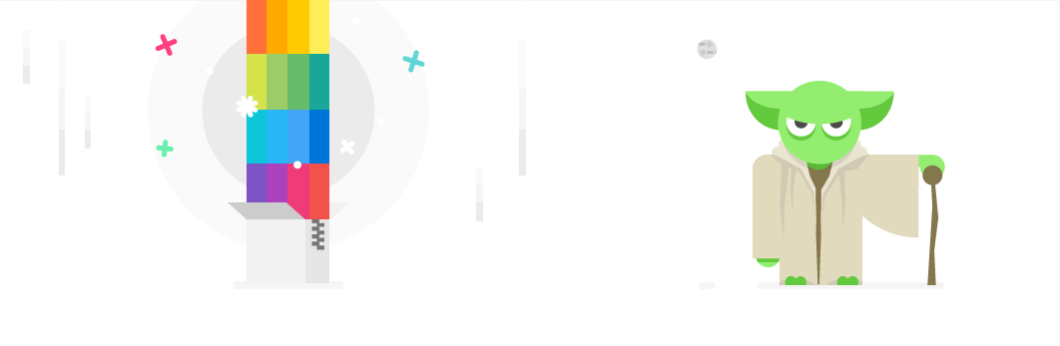
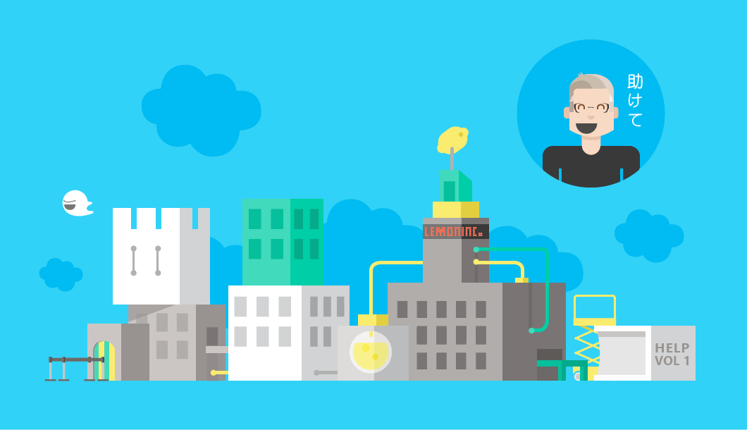

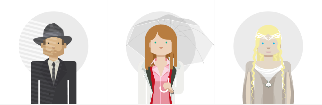
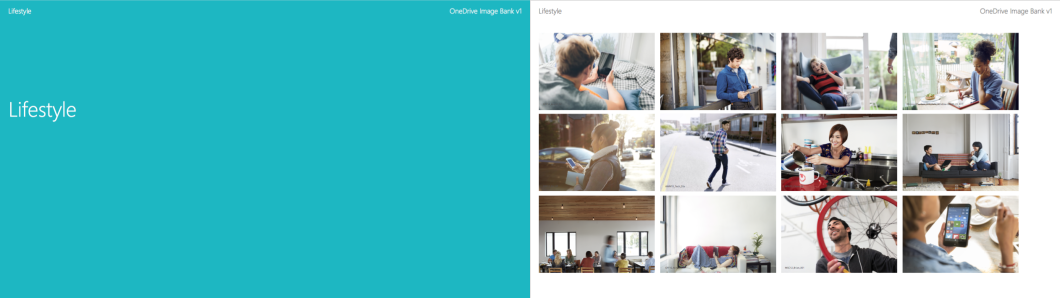
Image Bank
I created a OneDrive specific image bank with curated images from the extensive and stylistically wide-ranging Microsoft brand tools.
“OneDrive is for people of action—people who wear many hats, play many roles, and want tools that fit their whole lives.
Professional and personal. On their own and in groups.”
With this in mind, the images were grouped as:
Working
Lifestyle
Maker
Guys and Girls portraits
Visible screen/device images


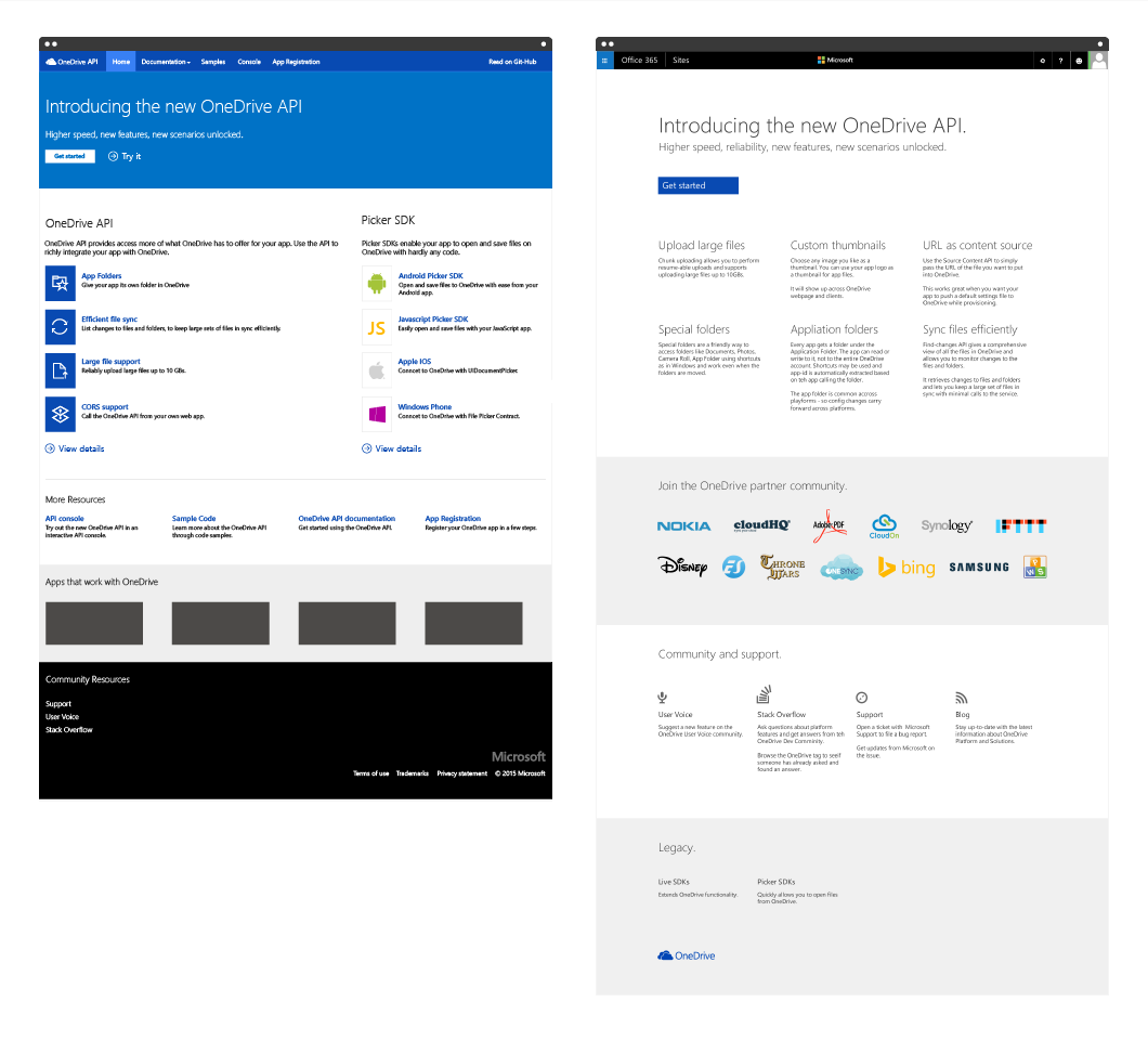
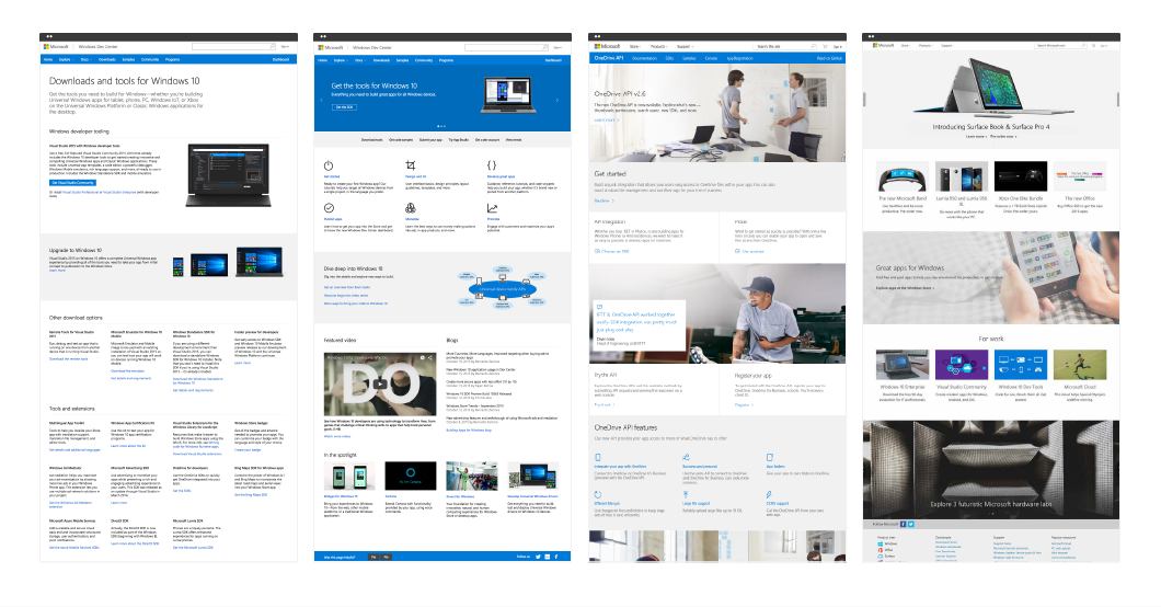
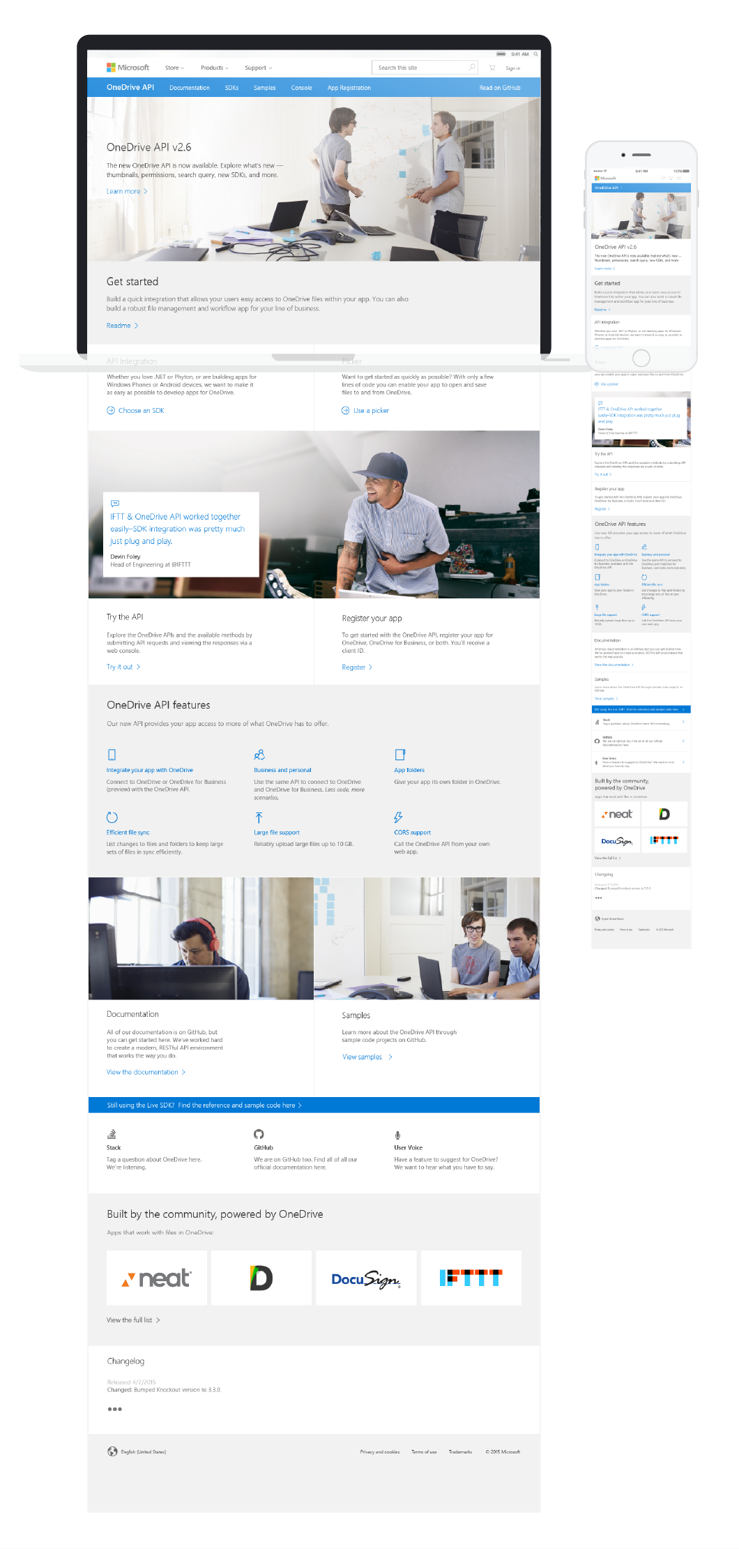
dev.onedrive.com
A one pager for the OneDrive developer portal. Because the OneDrive website was undergoing change, this was designed to fit within the wider context of Microsoft pages, and deliver a higher quality experience than many of the other developer portals.
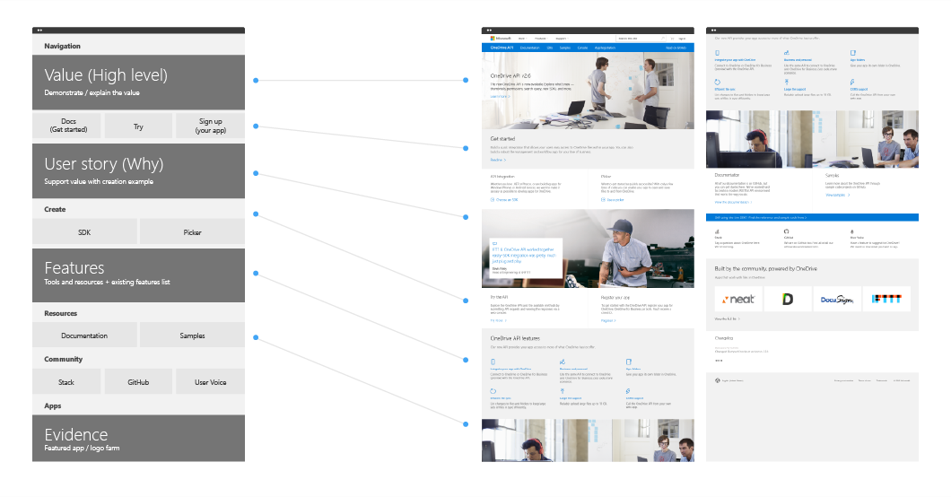
UX Goals
Communicate Value Proposition of the New OneDrive API
Assure apps are still discoverable on landing
Consistency of Microsoft and OneDrive brand experience
Provide better experience to separate communication of Value Prop and developer actions to get started
Process
Requirements/goals
Competitor landscape
Local context – Microsoft landscape
Wireframes
Apply brand and copywriting
Previous versions
Wireframes

Microsoft context
Final design
Motion
With the release of Google’s Material design standards, I produced this visual investigation of Material design applied to Microsoft OneDrive.
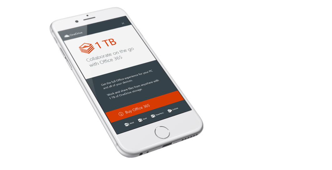
In-app notifications
I worked on a series of OneDrive in-app notifications and up-sell cards for Office 365 delivered on desktop and all mobile clients.
Key impacts and learning
Consistency and standards
Delivering quality design for a global corporate brand required sustained evaluation and attention to detail and consistent application of a developing brand.
Curiosity and focus leads to expansion
With the second version of the email template I was able to focus on requirements, and open the tool up to new features and opportunities.