Iocolor
←
A full-spectrum freelance project for Iocolor, a small studio providing bespoke book printing services to artists, museums, photographers, and publishing houses.

Overview
The company was looking for a brand refresh and website update to support their expansion into a new product offering – custom online book ordering. The key challenge was positioning print as a valuable product to a new digital audience. I worked to balance retention of their existing position as a trusted book-printing specialist with evolution of the brand.
Customer
Working with the client, I developed a customer taxonomy, organizing them into groups of large scale, smaller independent, institutional, and online ’prosumers’. Photography, architecture, and graphic design fields were identified as potential new customer segments for online sales. These fed into user personas that guided the creation of key user stories.


Design solution v1
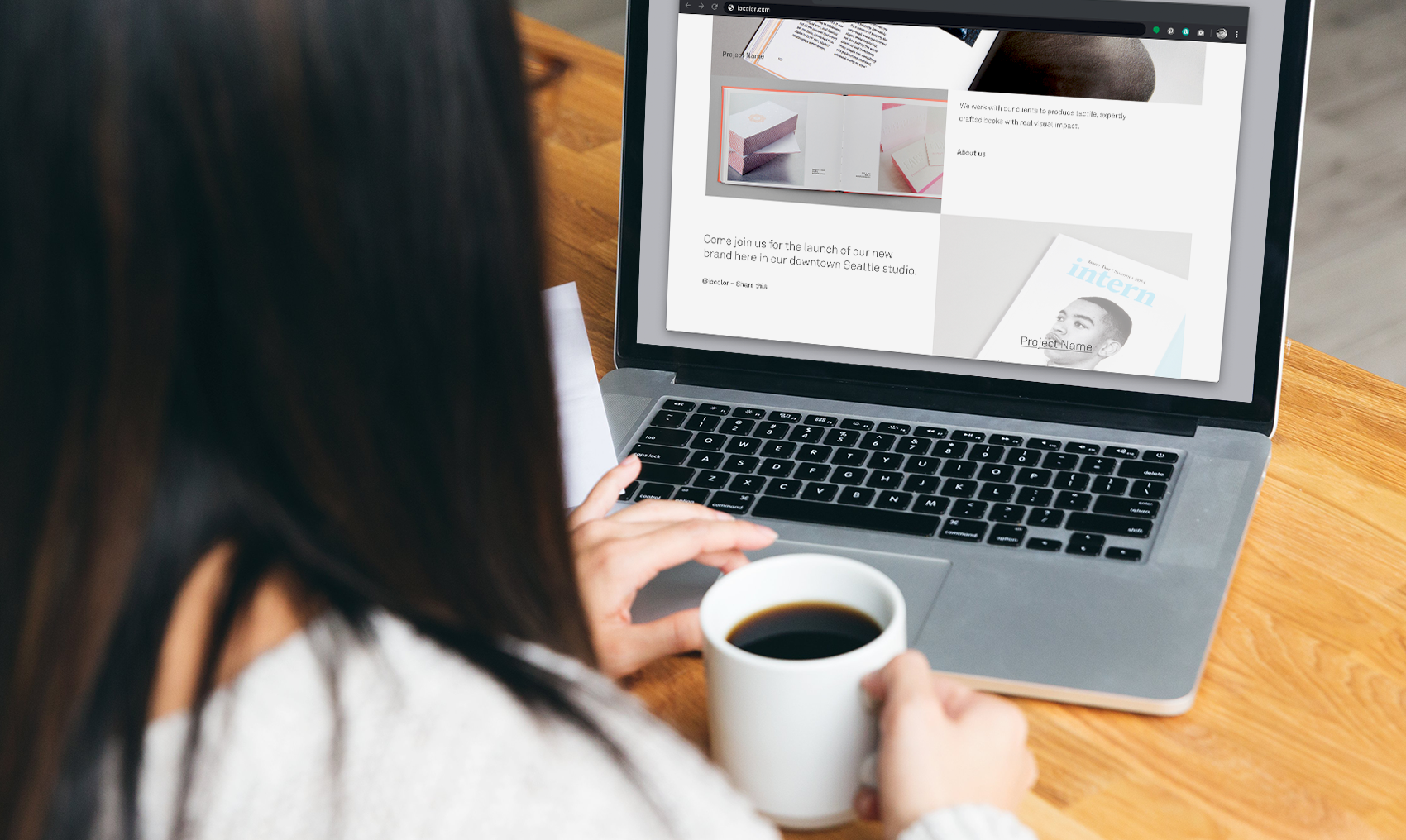
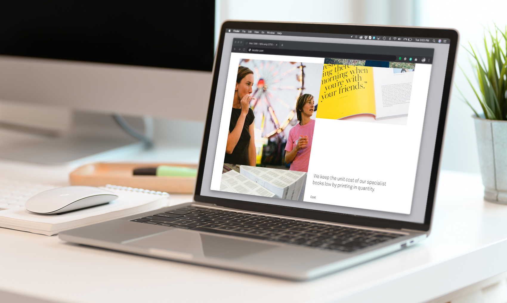
I developed and updated the brand to reflect the company’s core values and built a visual story that could be applied across connected multichannel experiences. I worked to refine the website stylistically, retaining some existing content but also expanding their portfolio to include case studies, sustainability, process, and their new online products.
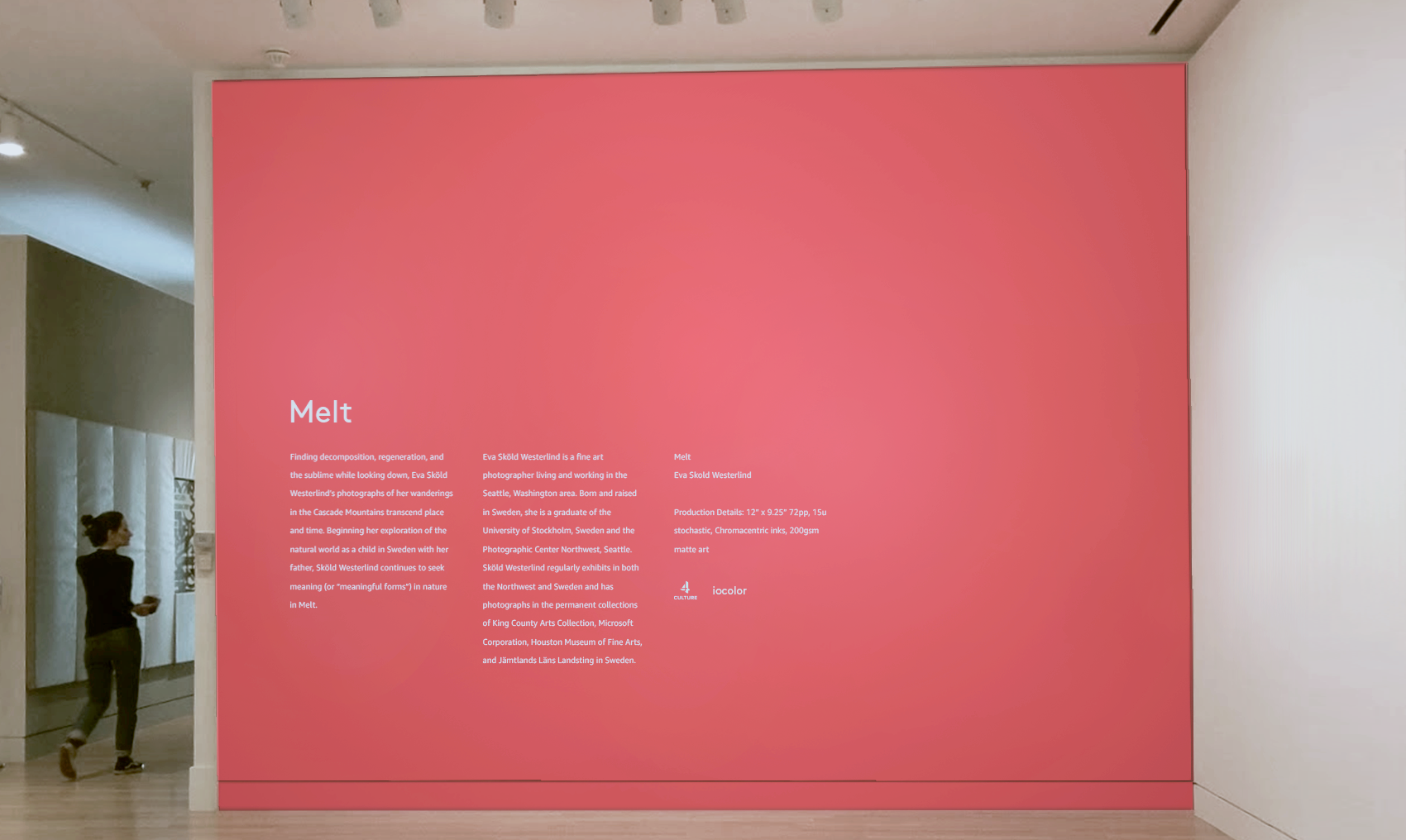
Using a model to build the brand around their company beliefs and vision, I began to look at building the visual style, symbols, and story for the updated brand. I created a set of mood boards and guidelines for product photography covering things like consistent lighting, level of detail, and presentation.

The new identity and website needed to be flexible enough to incorporate future initiatives and a growing number of communication channels. The visual style functioned across several touch points supporting their story across print, digital, and environmental channels. This consistent thread would allow Iocolor to retain connection with existing customers and grow into their new role as a connected and supportive partner to the design community.
I reworked the site IA, simplifying the main navigation from nine items to five, and moving lower level items to a sub menu and page footers. I ran a workshop to define the homepage content hierarchy, from which wireframes were created, reviewed, and refined.


Feedback & testing
Collaboration through regular team meetings and whiteboard sessions was key throughout the project. We used InVision for “live” feedback and versioning.
Design solution v2
With less reliance on block color and increased emphasis on photography, the product came to the forefront. I introduced more whitespace, a slightly different rhythm, and new brand elements such as the circular “sticker.” Inclusion of some Northwest looking photography helped root the brand in Seattle.


Impacts & learning
This project was paused before launch, but finalizing the designs for home, featured work, and about us pages and launch of the site would have been our next steps.
Communication
Remote collaboration tools helped move the design work forward, made more valuable alongside collaborative in-person meetings and working sessions.
Release, iterate, scale
After launch, we would iterate using customer data, test, and phase-release larger features such as the product overviews and a book maker tool. Maybe even throw a launch party for each new release!