Brief
Website refresh and expanded careers section for a global chip designer and manufacturer.
New users and existing culture
Key challenges included working to ensure we were portraying a true reflection of internal culture to people shopping for a new career opportunity, and integrating new work into an existing brand.
Before state
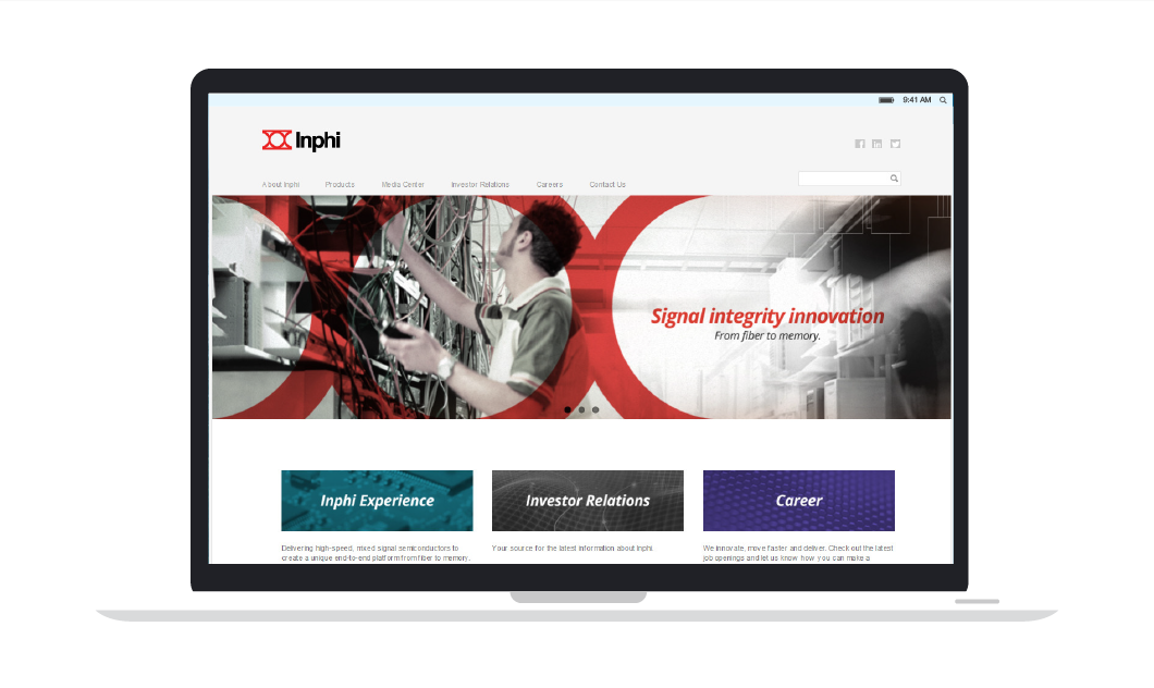
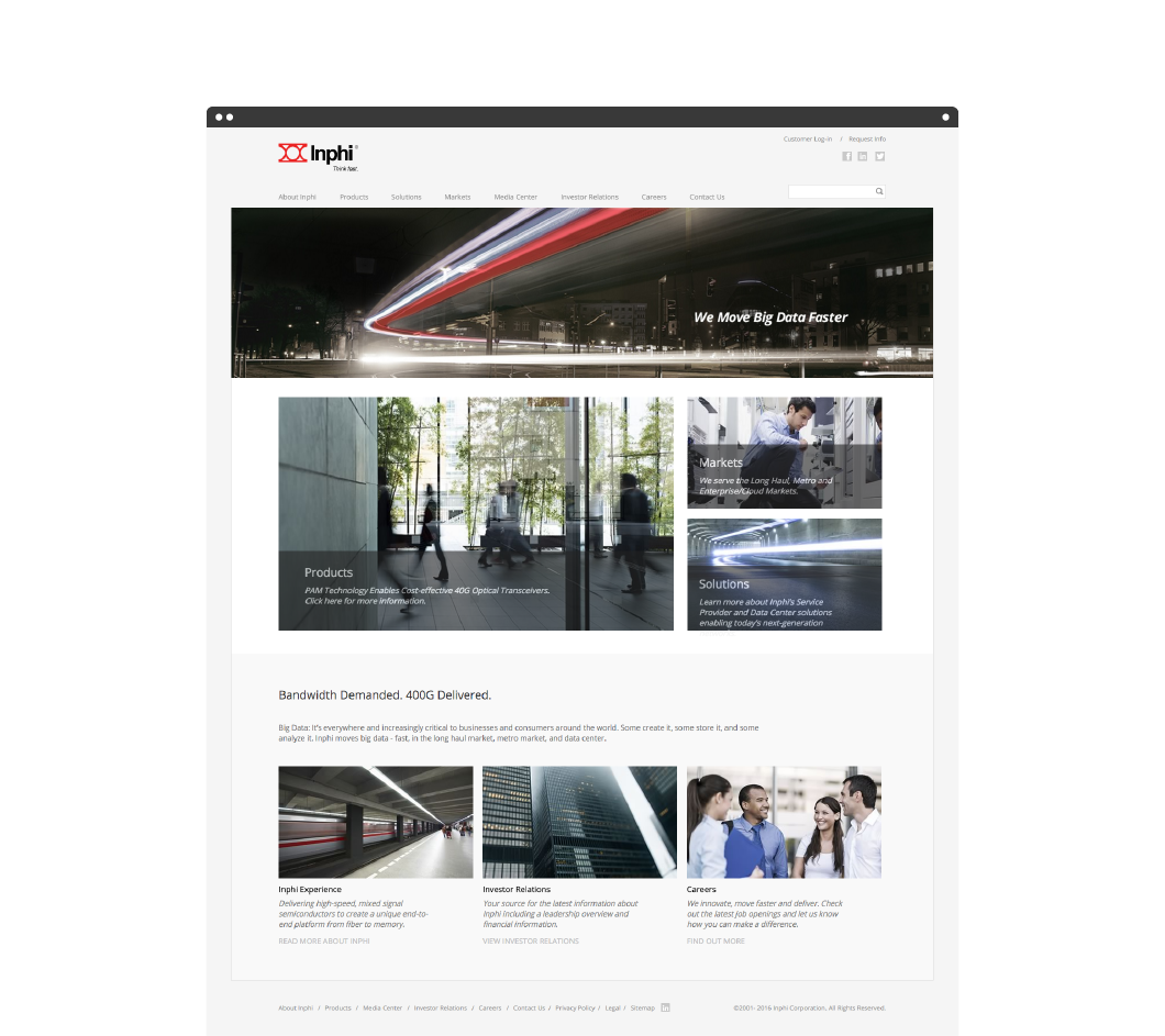
Before this the careers section simply consisted of an iFrame containing an open jobs list. The homepage (pictured below) wasn’t working as hard as it could to convey the brand and aid navigation.
Process
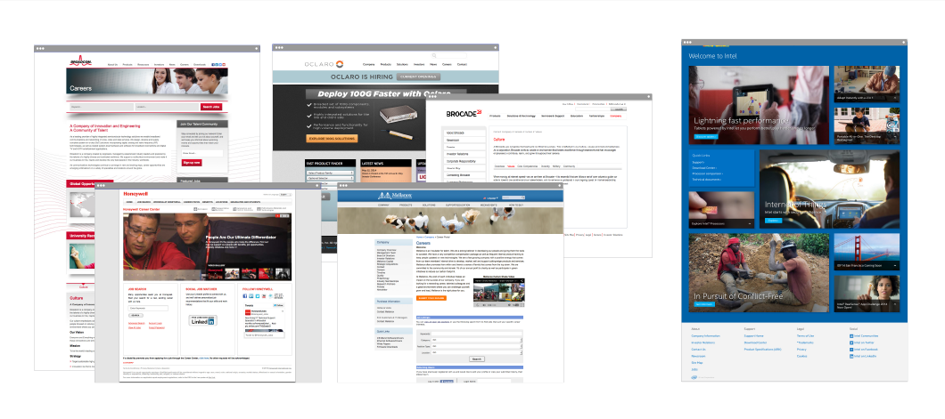
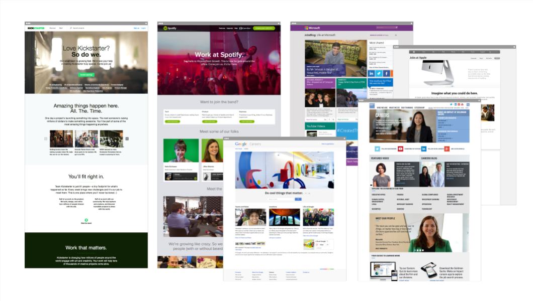
Contextual data: Industry space, similar & comparable companies
Employee interviews
Wireframes
Application of brand
Custom photography
Initially I gathered and analyzed contextual data.
Specific attention was paid to industry standards, voice and ways in which Inphi could raise the bar.
Voice
“Amazing things happen here, all the time.” – Kickstarter
“Want to join the band?” – Spotify
“Imagine.” – Microsoft
“When it comes to our values, you’re top of our list” – Qualcomm
Brand perception / personality
Experienced
Focused
Dynamic
Human
Proposed voice for HR section
Be clear, honest and engaging
Use positive emotional words and counterbalance expertise
Use human / empathetic language
“Join the team, grow with us.”
“We hear each other loud and clear.”
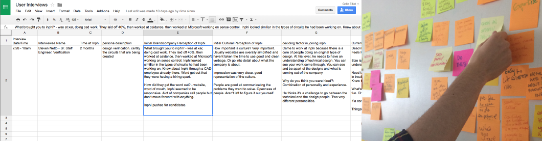
Diverse employee interviews
The creative director and I conducted a series of telephone interviews with employees from several teams and levels of seniority across the company.
Questions focused on
- Perception (Initial and Current – company/product and culture)
- Deciding factor in joining
- Ideal HR site
- Website feedback
The data was gathered in spreadsheets, mapped out and grouped into key areas of feedback.
“Contributing to projects with complexity and speed takes a collaborative effort with people in each department.”
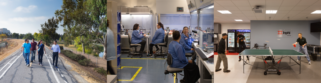
Photography
We focused the company’s image direction upon two distinct areas reflecting both brand and product attributes:
1. Human/interactive/real
2. Technology/motion/speed
This included an update of their stock image library and custom on-site photography at both their Cali locations.

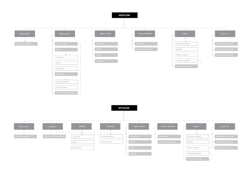
Information architecture
As well as adding an entirely new Careers section we were also asked to update the homepage, and expand the Market section to have three individual landing pages.
These AI diagrams investigate the location of these relative to top-level navigation.
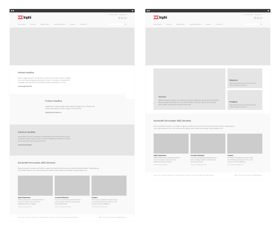
Wireframes
Home
Below are two home page wireframe solutions, and then a screenshot of the live site.
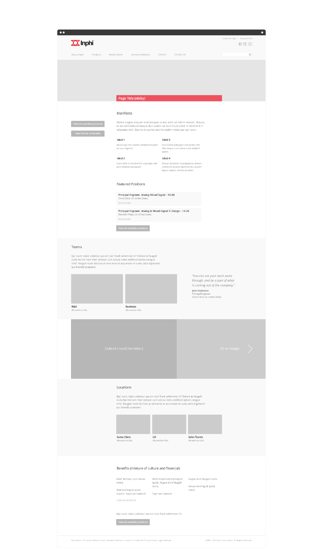
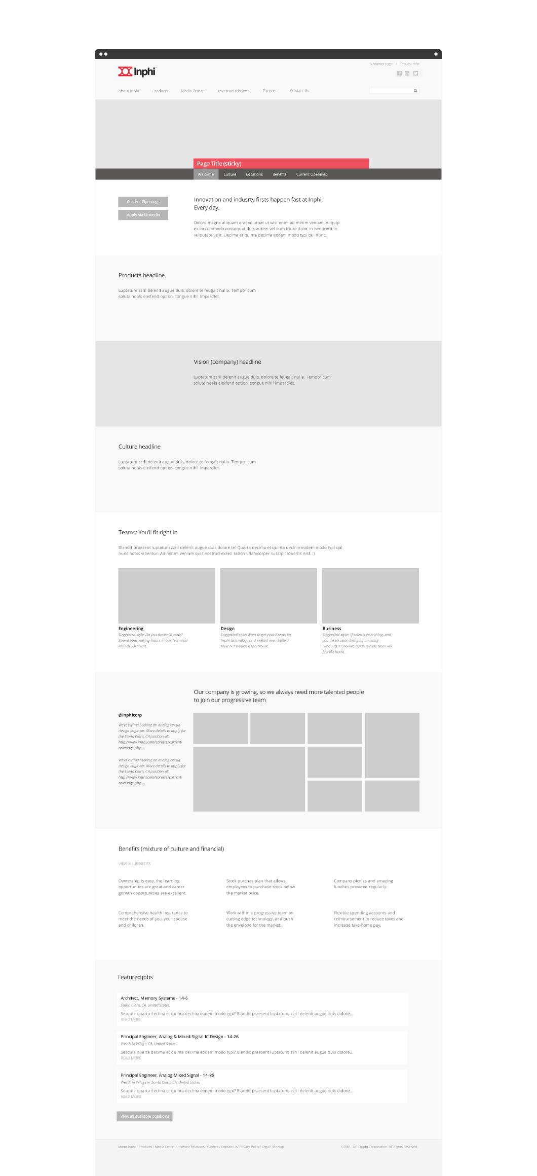
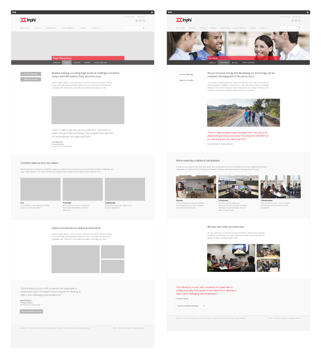
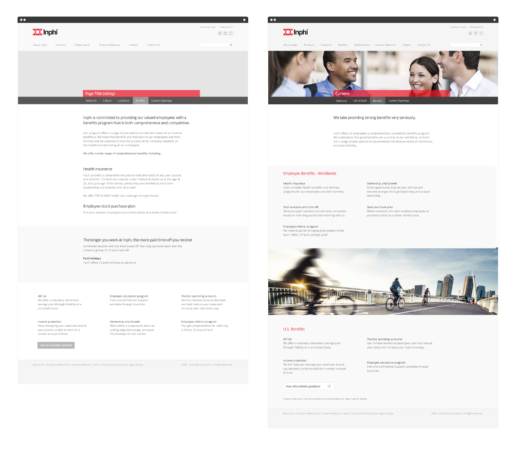
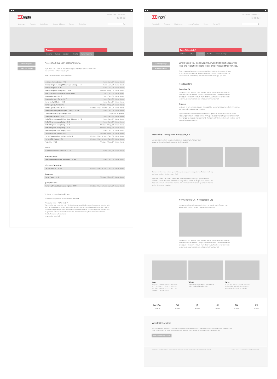
Careers section
The first wireframe option below with alternate delve-in points was rejected in favor of a tabbed navigation strip.
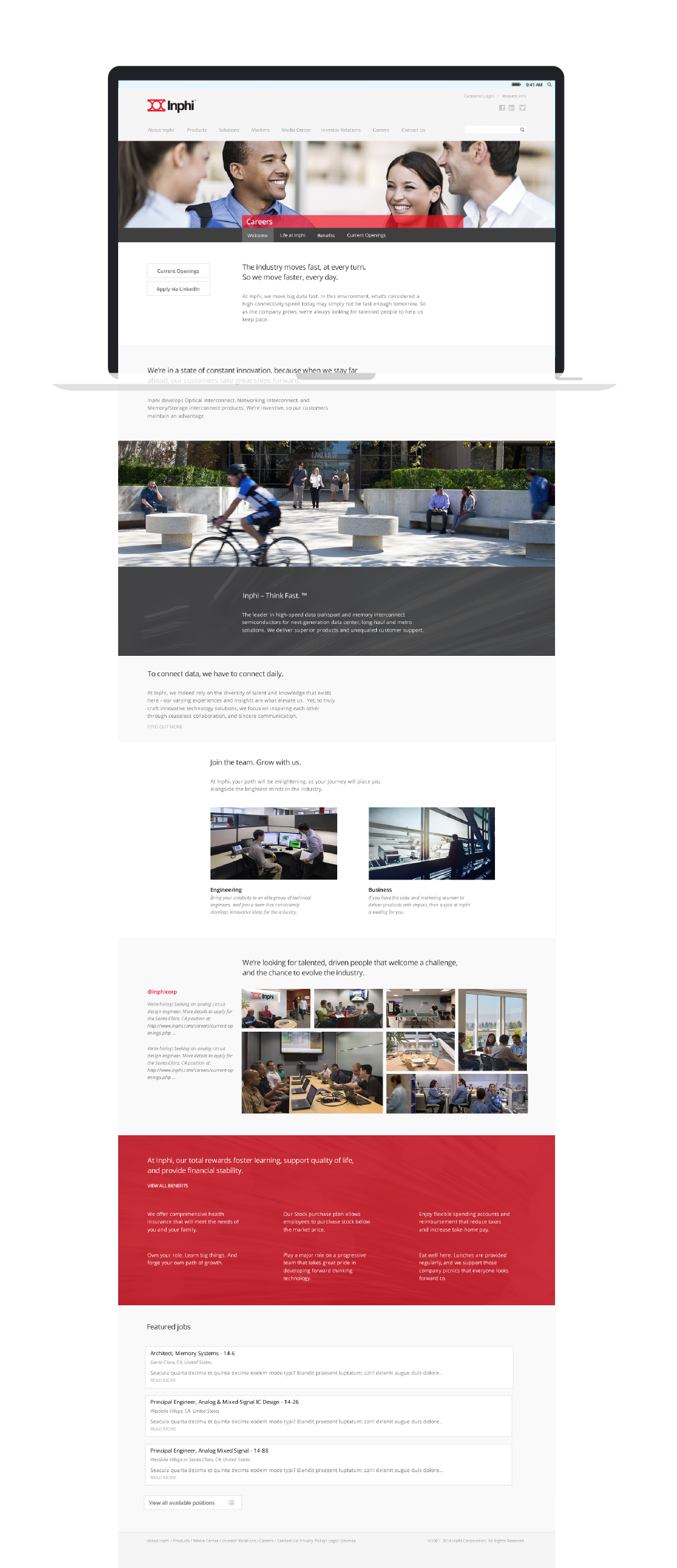
Because the wireframes were relatively high-fidelity, most of the wireframes transferred well to the final deliverable – with the exception of the locations page which was shelved for later.
Culture
Job listing and locations
To increase legibility I wanted to apply striping to the list, and although the listing was delivered through an iFrame I discovered that it was possible to add some simple css styling to the form at its point of origin.
Key impacts and learning
Research & data
The data was gathered in spreadsheets, mapped out and grouped on walls and then for the broader site changes we used the relevant findings to build a clear picture of user requirements.
User journey
On the homepage and expanded Markets section, we moved the consumer journey to the center of the story, and improved usability with revisited user flows and requirements.
Evolve
Having the time to gather and arrange data from the interviews was extremely valuable in moving the site and brand forward. Follow up data collection from new employees and users will be equally useful in subsequent versions.