
As the sole designer, I helped evolve the WorkDocs secure file storage and sharing product, producing simple and beautiful experiences that balanced enterprise-level functionality with ease of use.
Before state
My previous design team had implemented a design style that while succeeding in modernizing the look of the product, hadn’t had any significant effect on the user experience.
Brand perception / personality
Customer centric (Amazon & AWS core tenet)
Simple and intuitive
Approachable
Enterprise security
Process
Review existing WorkDocs apps on iOS, Android, web & native
Card sort and IA options
Develop base design framework
Apply IA to framework
Simplify and refine design patterns
Prototype & gather feedback
Iterate, review & launch
Continue to gather feedback and shift focus to list views, sharing and collaboration
User flows and customer engagement
I produced user flows for key interactions and new features including file backups for Drive (a native desktop app), collaborative editing and open with Office 365. I also produced decision flows for commenting and drafts notifications.
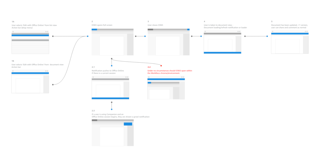
Click to enlarge the above flow
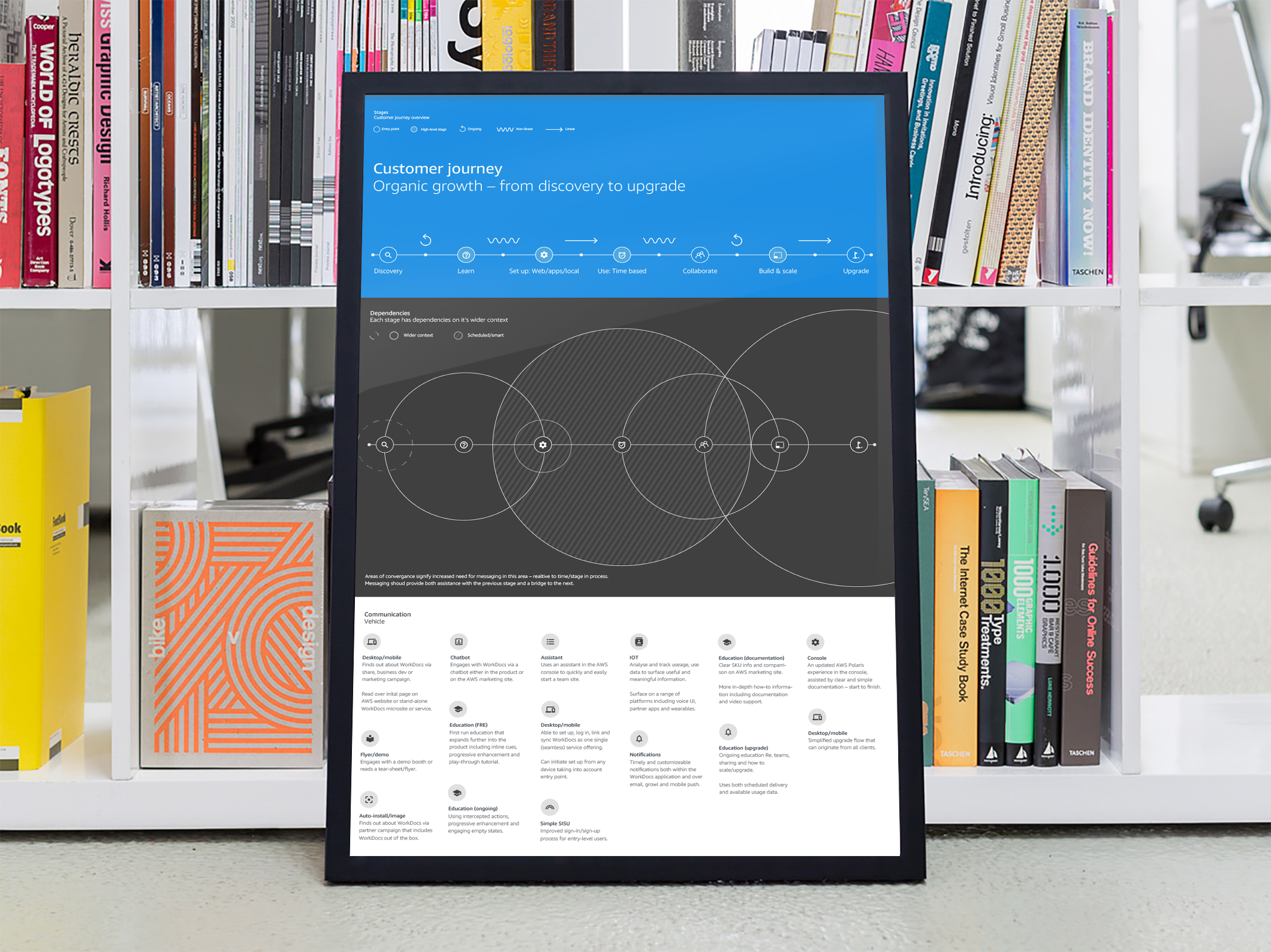
Below is an excerpt from a customer engagement map I produced to highlight areas in which the product could help meet a set of defined goals and bridge any gaps – ultimately leading to team collaboration and scaled usage. A combination of in-app notifications, email, targeted landing pages and other vehicles would be used to support and drive engagement.
User goals
I want a simple file share service
I want a scalable SMB file share & storage solution
I want a team collaborative environment
I want a seamless experience across devices and locations
Web client
v1
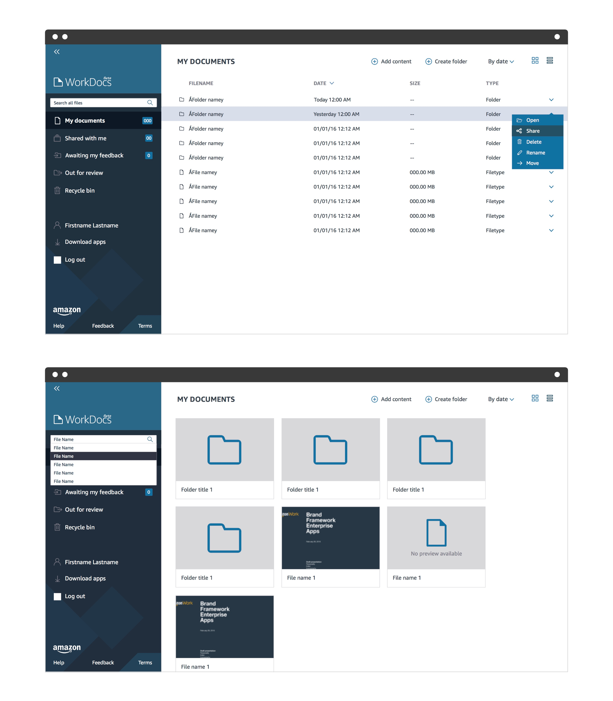
The initial redesign focused on an updated framework for layout and control and updated navigation. I worked up some IA options validated through card sort exercises and user testing with quick design prototypes. Some variants are shown below.
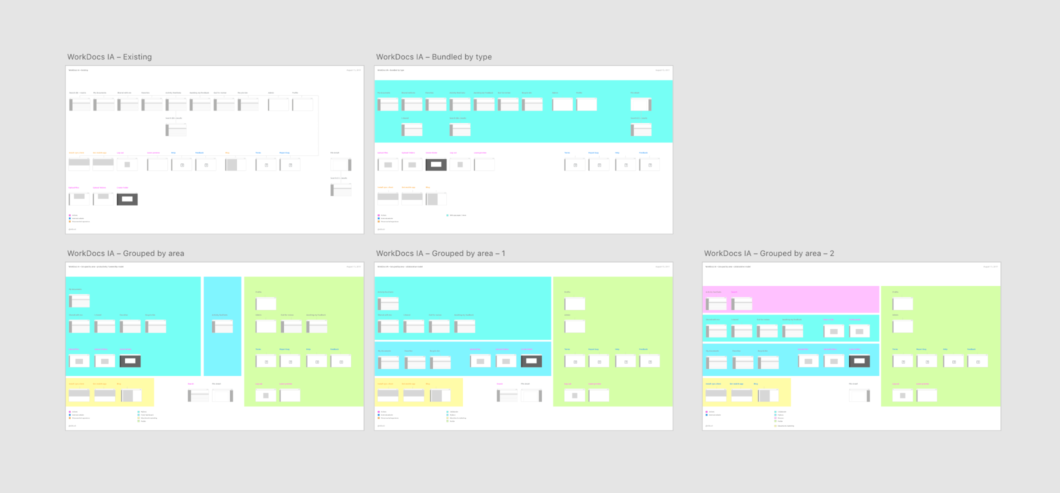
Click to enlarge the above IA diagrams
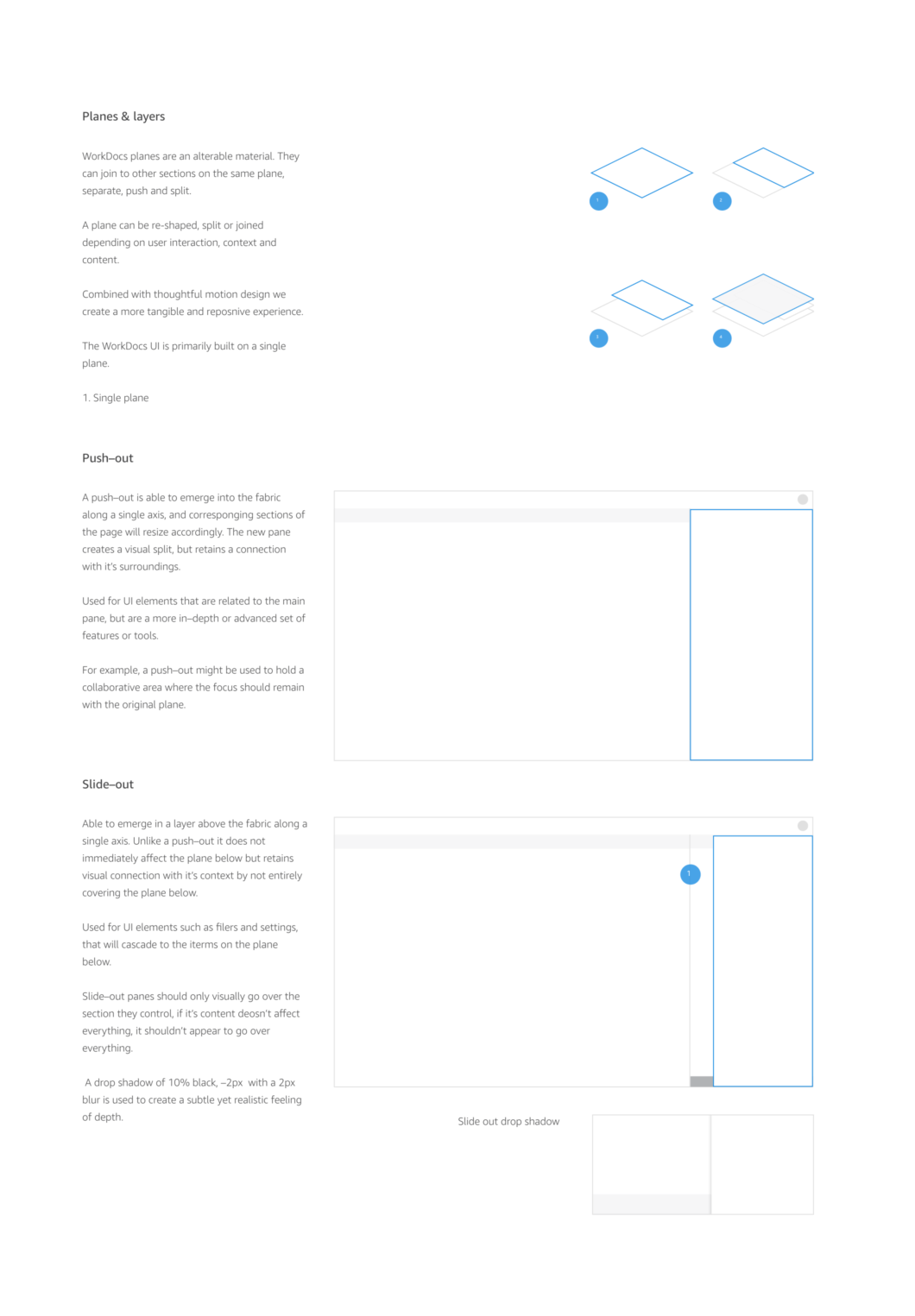
The new framework defined the positioning of actions, settings, location controls and main navigation, and provided a solid foundation upon which to structure the UI.
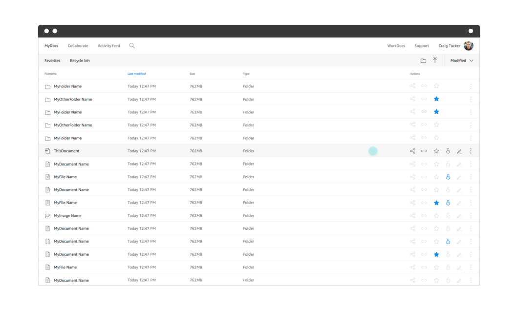
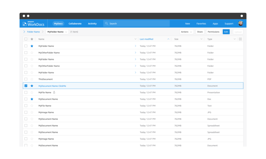
I worked to simplify and refine design patterns, including a simplified color palette, moving from twenty-four colors down to seven.
The updated WorkDocs blue (#1B8DE2 2382 C) is more vibrant, future facing and invites attention.
It retains an acceptable minimum contract ratio for accessibility when paired with the lightest grey in the color palette, as did the two darker grey tones in the palette.
Importantly, the new brand blue was key to creating an intuitive and simple to use experience for WorkDocs users.
The blue color reinforced the WorkDocs brand, and against a light overall theme, served to highlight primary actions and focus user interaction. It was also used to provide a wash color to key areas such as the drag and drop overlay state.
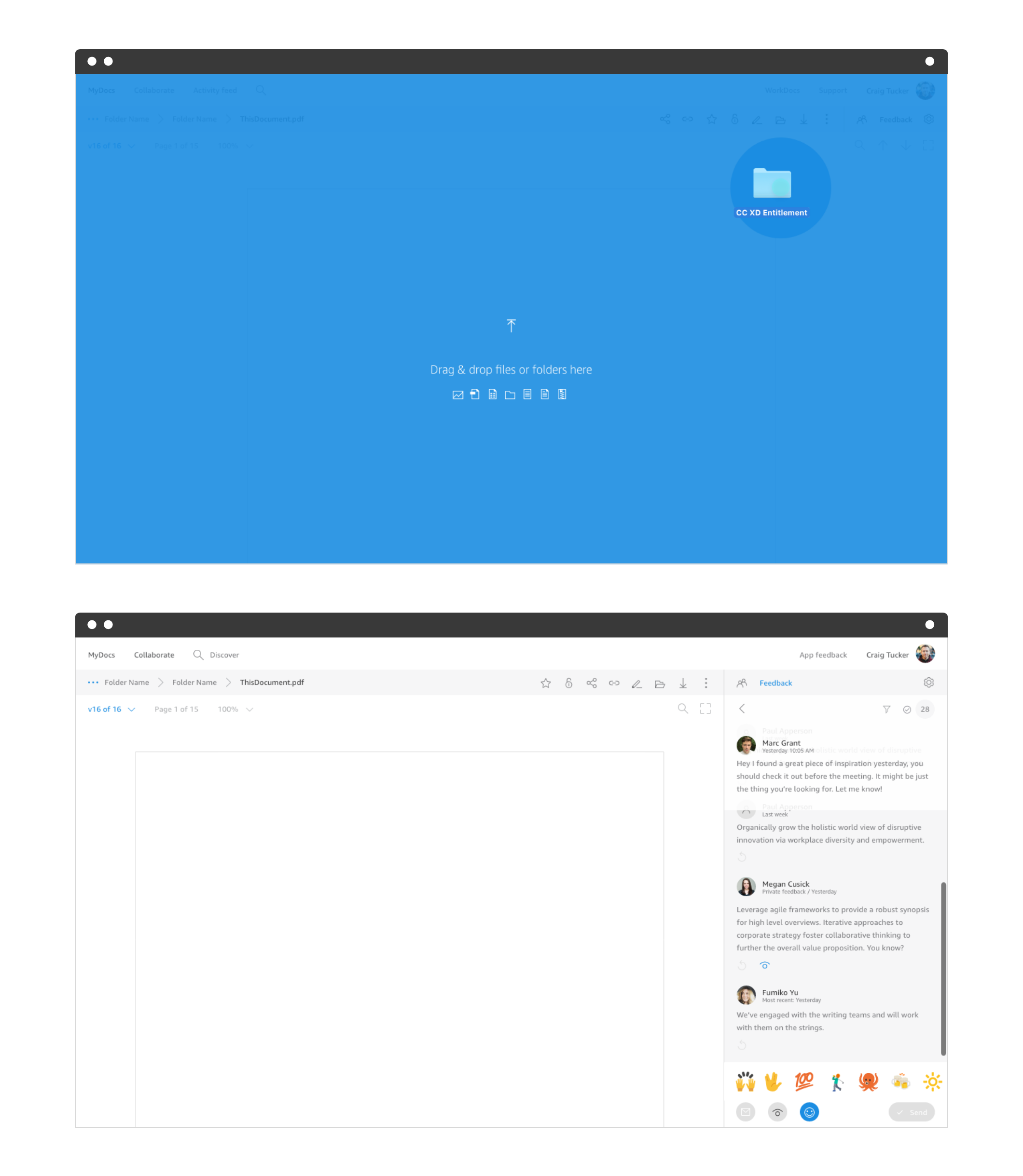
Contextual controls were a core part of the re-design. These controls change based on the user’s intent, and I added a handful of one-click actions for invite, share, favorite and lock/unlock. Almost all of these actions were represented in the UI through a redrawn set of icons.
Research
Besides contextual industry research, which I tried to avoid, I carried out several rounds of guerrilla research with internal Amazon employees using design prototypes and set tasks to gather data on my design work. I was also able to send targeted surveys to existing customers that helped validate design decisions, find opportunities for improvement and steer future product development.
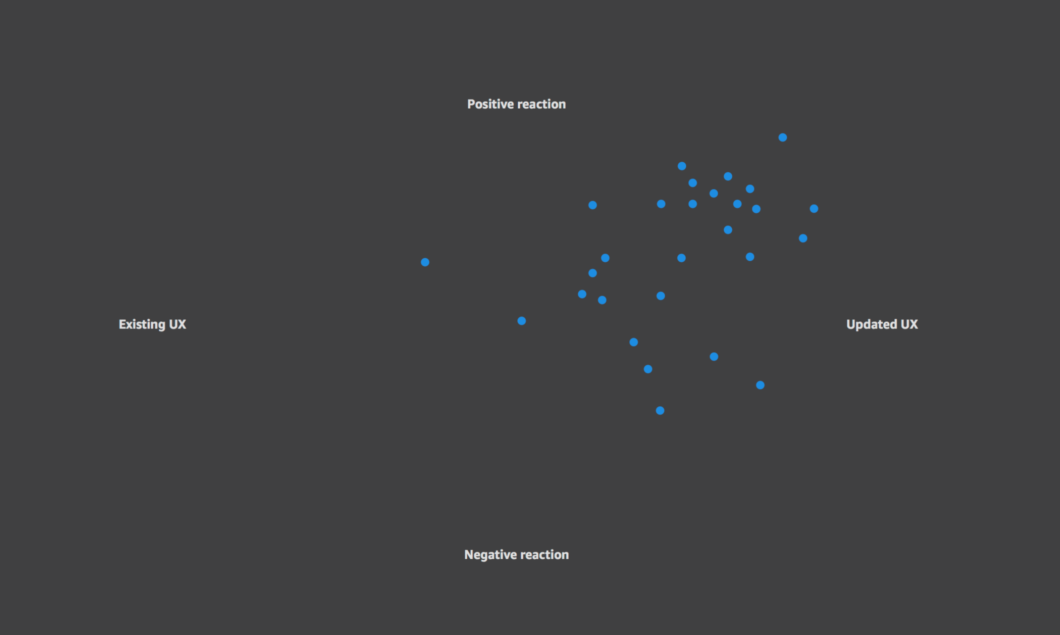
After launching the first UI update user reactions were mostly positive, and although there was some cognitive load for existing users when using the new IA for the first time, the organizational benefits soon became clear.
“I like very much how you have arranged the navigation. I think this is a huge improvement.”
– Amazon user
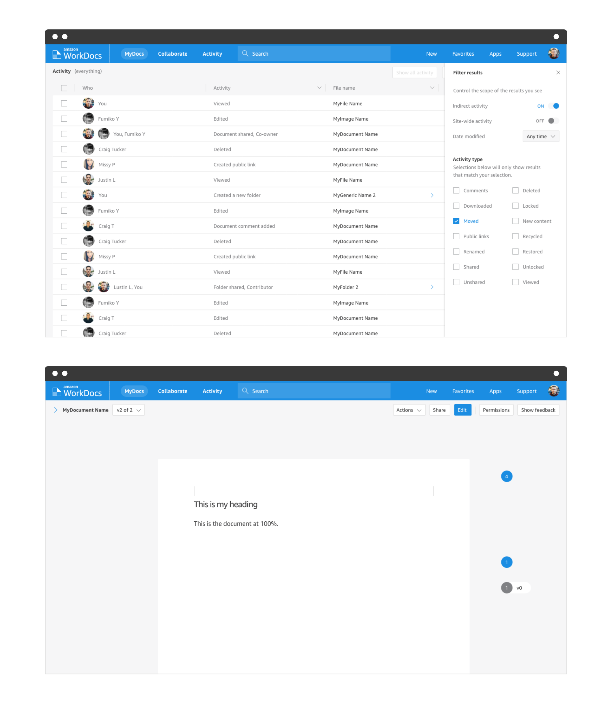
Feedback gathered through my own research and user forums highlighted that sharing, permissions and easy on-boarding were perceived as highly valuable to our users. This guided the second release and evolution of the web UX.
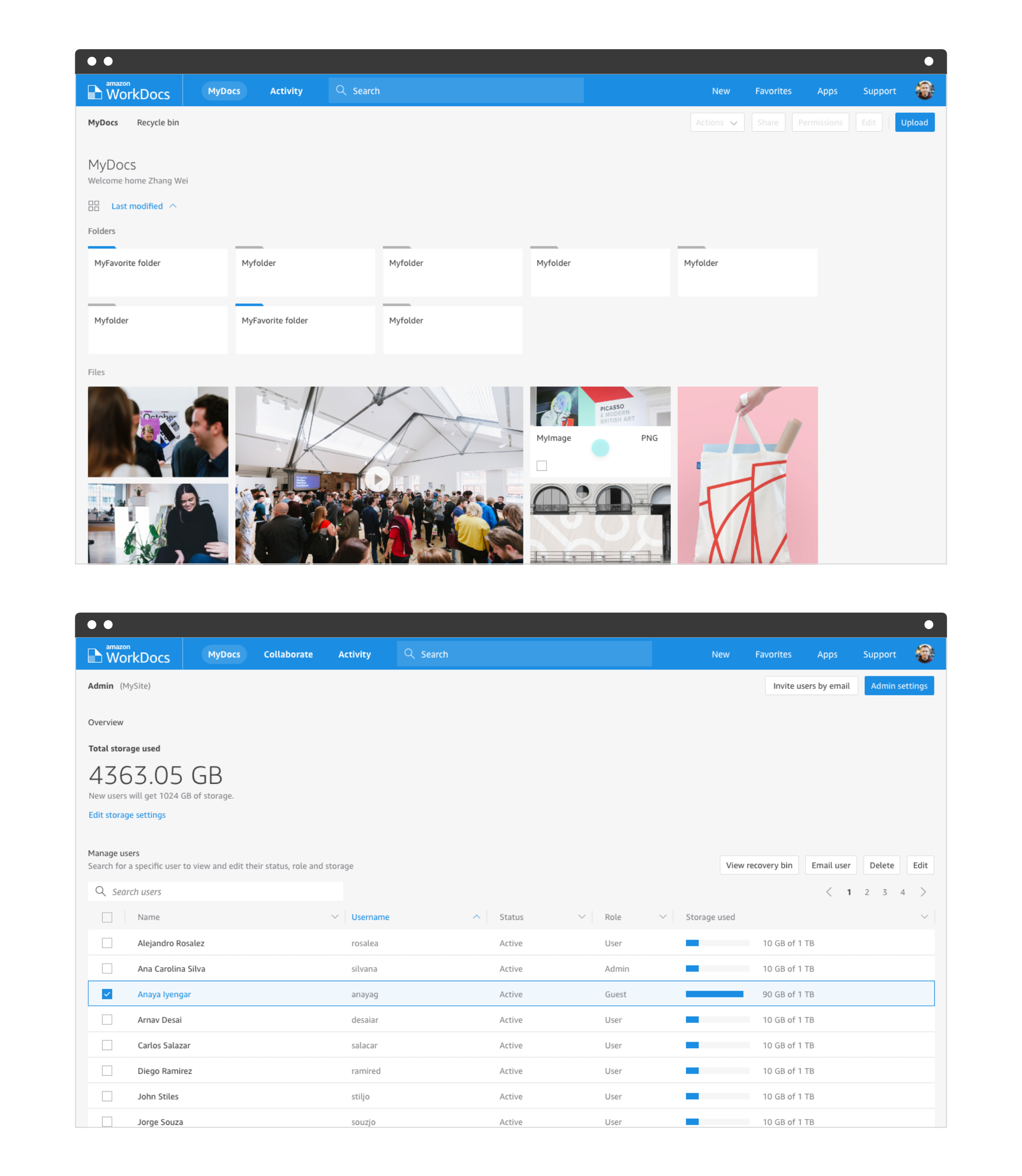
v2
User feedback and focus on simplification of the controls presented opportunities for a better experience across the entirety of the product.
In designing the updated web client UX I looked at the Polaris AWS design language for places to drive consistency and places where I might extend patterns.
Because the users are different, directly following design patterns for the AWS console wouldn’t have been appropriate for the WorkDocs consumer-facing UI. Where possible I made use of existing Polaris research and applied their patterns to areas of overlap – such as table-based lists with check boxes for selection.
I removed as many icons as possible, replacing them with actions that remained in familiar locations, but in a larger text-based button style.
This use of familiar controls produced value for the user in reduced learning curve for on-boarding and sharing, and made the UI more extensible for future additions.
“The ‘Actions’ tab is simple to find and you can get most things done in that area. Nice job with that.”
– Amazon WorkDocs user
User feedback from design teams using the service as a design depository and proofing tool led to a more visual treatment for the grid view, and Admin users had a clean overview of their site and controls.
During production of the design I produced several prototypes including full click-through prototypes. In the interest of deciding on one particular design proposal in which the top nav was to hide but controls would still be accessible, I coded an HTML/CSS version of the list view that was then expanded into basic React components.
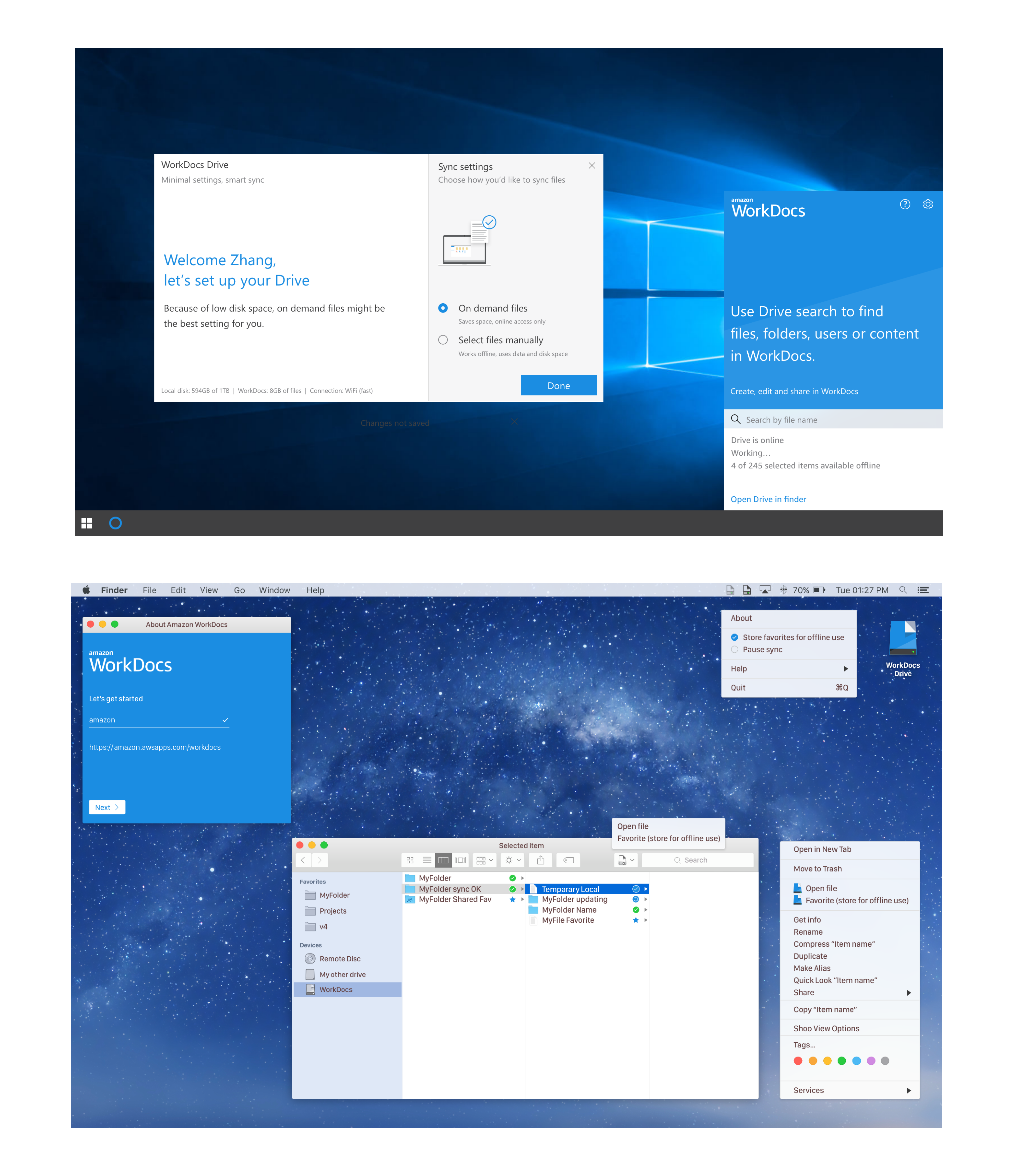
Native apps for PC and Mac
I produced designs for Drive, a native sync client for PC and Mac. Each was designed to suit their particular environment, and as with the mobile apps, made use of native patterns while retaining an element of brand consistency.
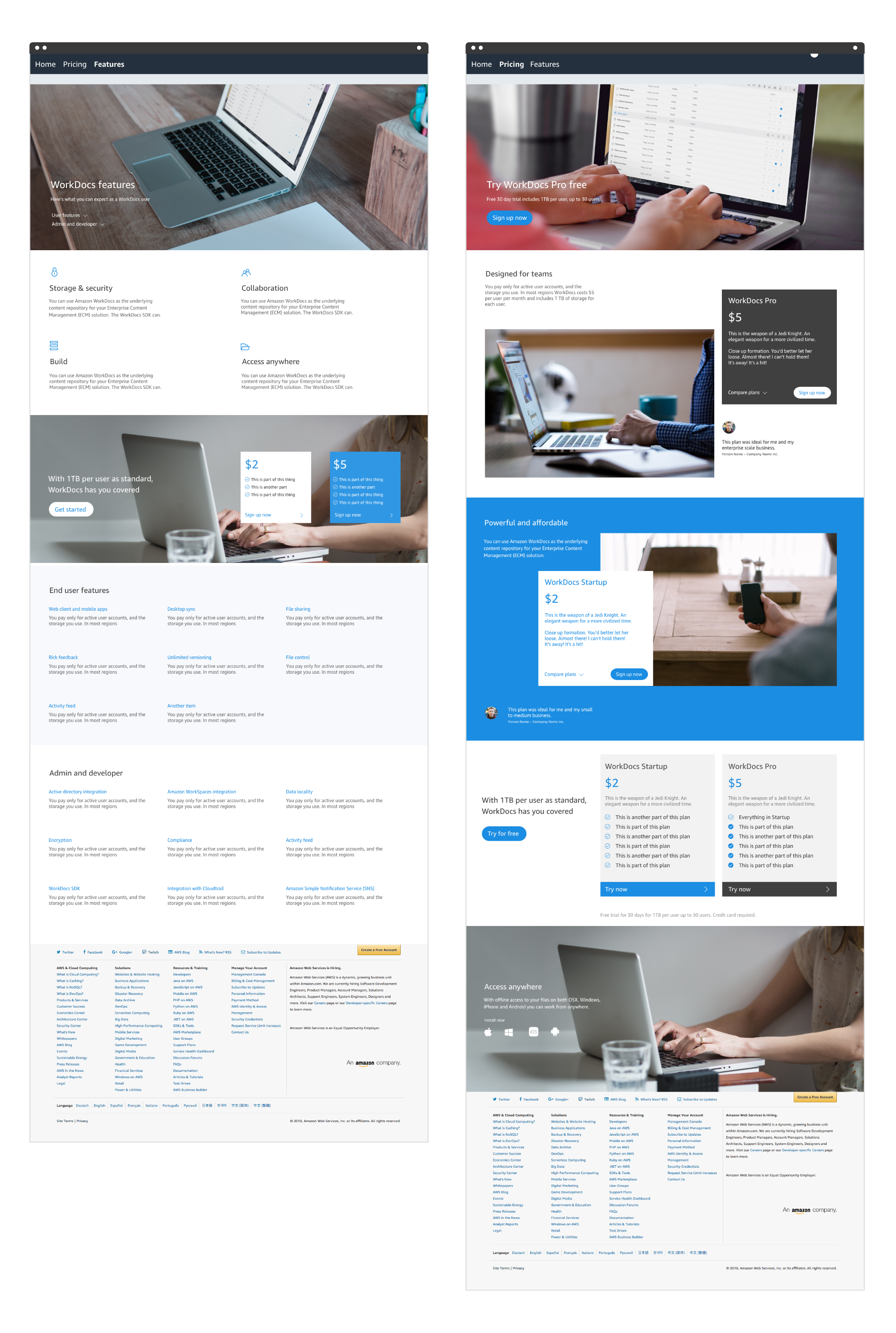
Web design
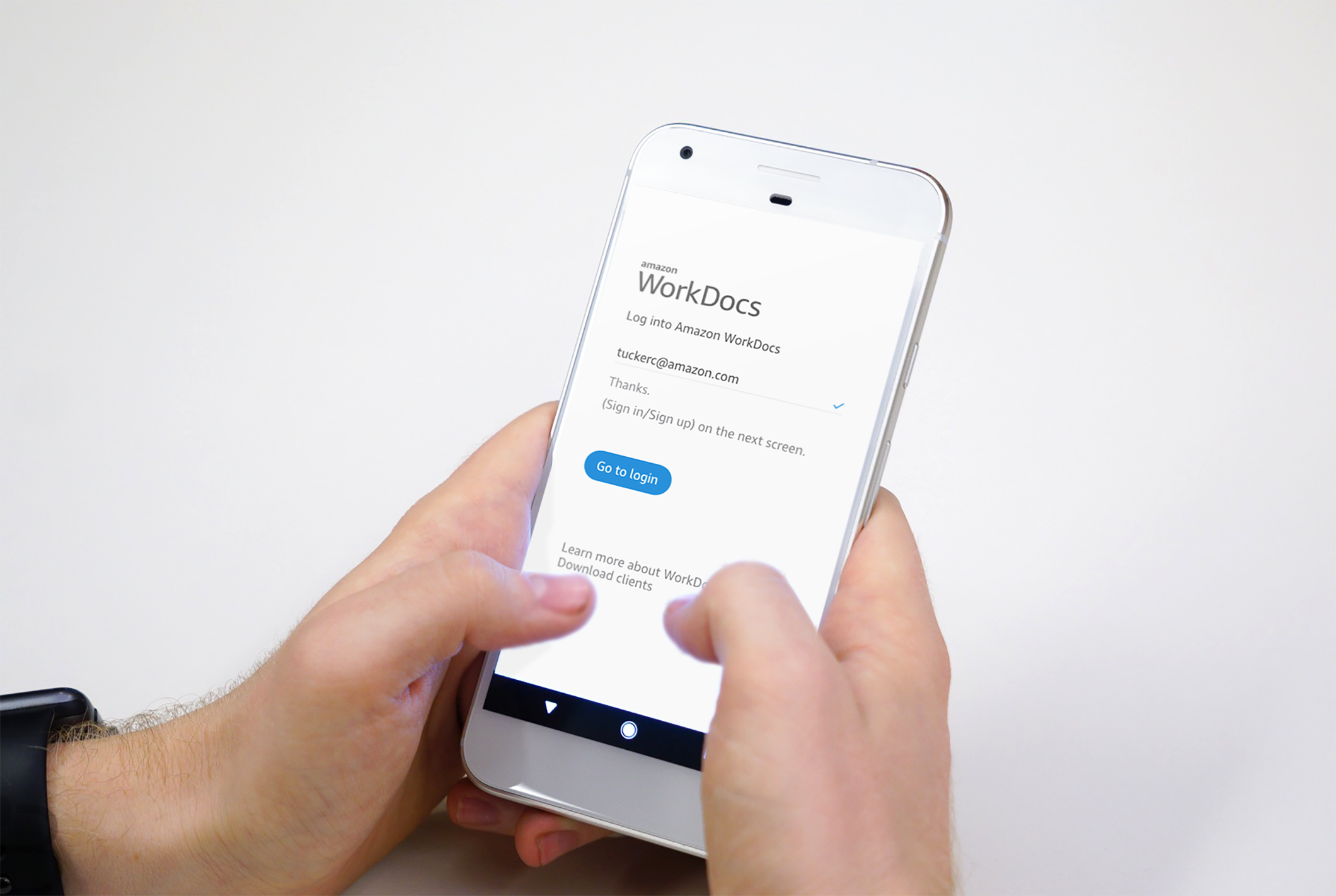
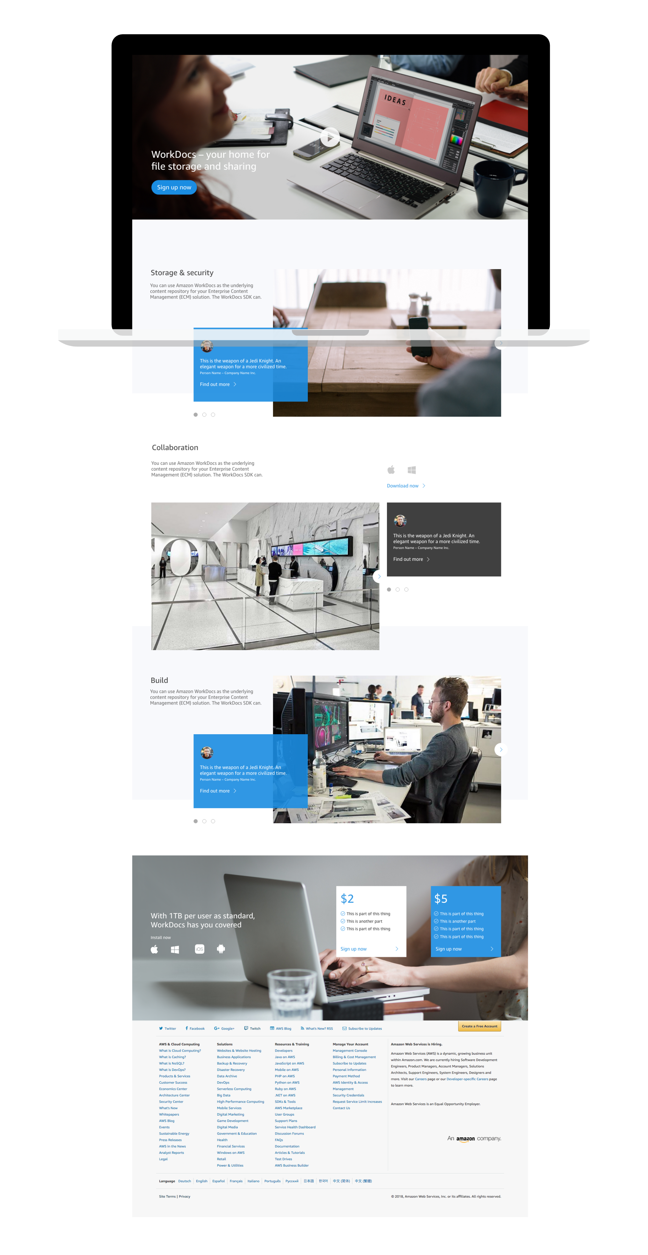
I produced designs for updates to the marketing website, and some other key areas of customer interaction such as the main login screen.
Consistent color, imagery and voice was applied to all – further developing the simple, secure and approachable feel of the brand.
Key impacts & learning
I contributed to several product releases over my first year on the team, and WorkDocs saw an increase in its user base of over 30% during that time.
By focusing on clear work areas, straightforward navigation, and intuitive controls, my work helped move user content to the forefront.
Business requirements vs user need
Finding a balance between business objectives and user requirements is a key element of designing for the enterprise space.
Extensible systems
The base framework and design patterns I developed for WorkDocs provided a flexible and consistent UI that will allow the team to evolve the product in the future without making major changes to the underlying design system.